|
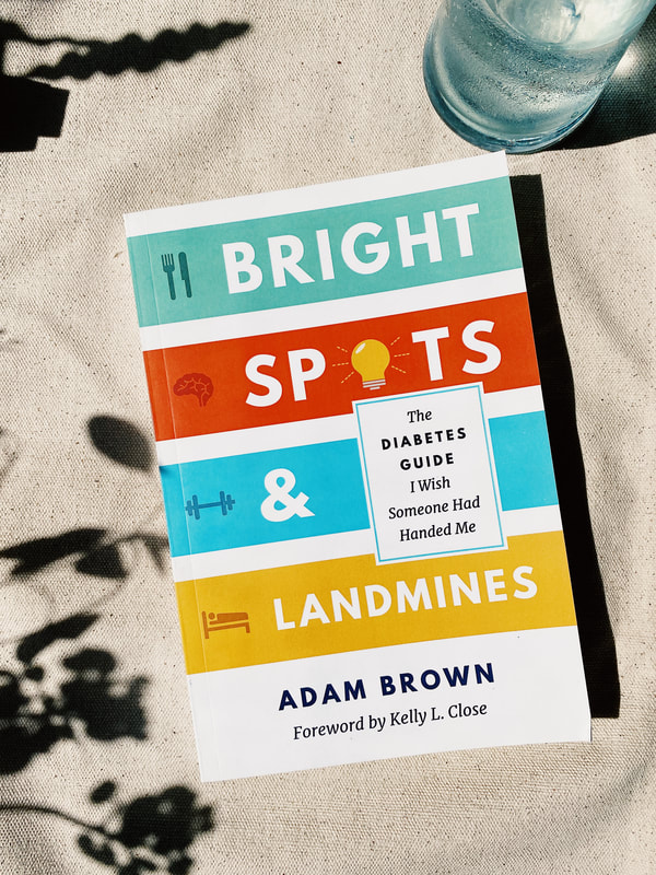
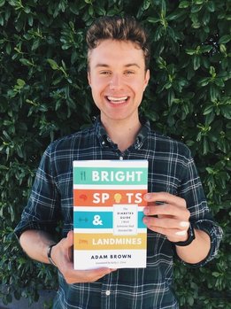
In 2017, The diaTribe Foundation published its first full-length book entitled Bright Spots & Landmines: The Diabetes Guide I Wish Someone Had Handed Me by Adam Brown. As the sole designer on the project, I crafted the Bright Spots & Landmines visual experience, from the book to its marketing and web presence. This project was a year-long effort from a passionate grassroots team, many of whom had never embarked on a publishing venture before.
|
Making diabetes... awesome?
|
One of the earliest (and quickly canned) title ideas for the book was “Make Diabetes Awesome,” which was quickly ruled out since “awesome” probably wasn’t a word most people would use to describe diabetes. Yet, with any crazy idea, there was something there.
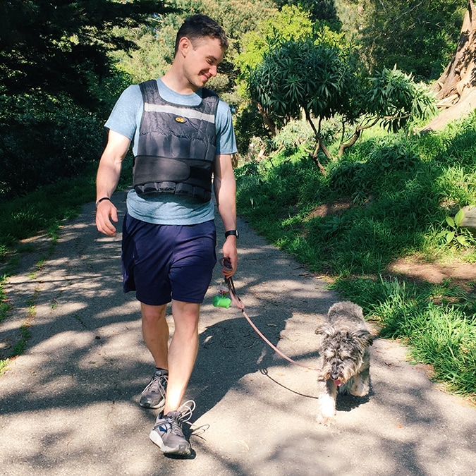
Instead of awesome, I landed on the word approachable. The idea of making health tips, especially for chronic disease, approachable—dare we even say fun—was a challenge I really wanted to tango with. This word was at the top of my mind throughout the design process, and it informed my typography, color, tone, and photography decisions.
|
I wanted Adam's writing to fall inside a visual language that invited people into the conversation and encouraged reflection about diabetes management instead of giving a single, authoritative opinion.
Marking a trail to success
|
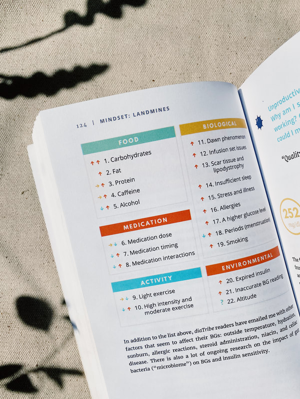
As I made my way through the manuscript, I could imagine Adam’s tips as sign posts along the diabetes trail; you were still ultimately in control of where you were going, but the signs could help point you to different routes. Following that thread, I kept the illustrations straightforward so people could easily navigate the reading experience—whether they were reading the Bright Spot or Landmine sections or the book’s four key chapters.
|
A single color palette can lead to drastically different applications. The final badges are pictured on the right along with the four final chapter graphics.
|
However, I had to be conscious of the emotional tones road and trail signage could represent. The initial concepts for Landmine badges (left) didn’t feel friendly at all, but more like a warning. Although Landmines are supposed to represent some of Adam’s less-than-ideal diabetes habits, I tried several iterations until the badges felt informative instead of oppressive.
|
”
|
Cover to cover and everything in between
|
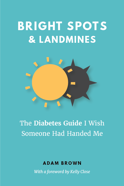
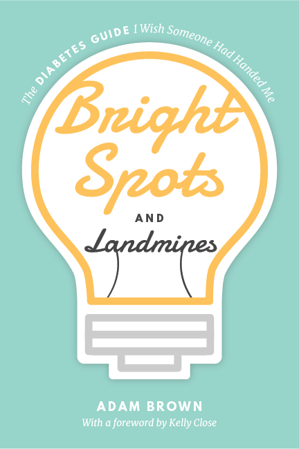
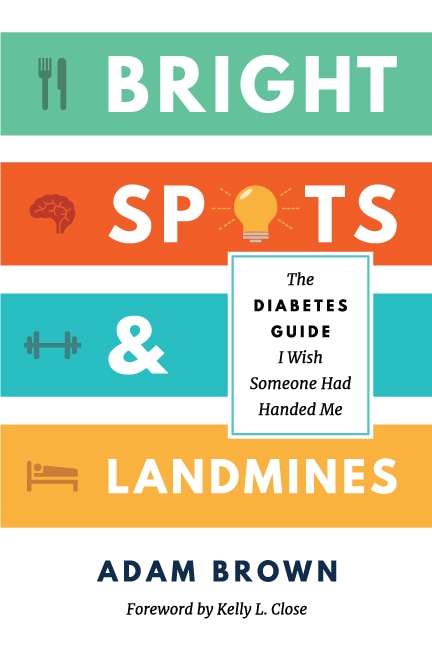
Once the design language was established, I had to tackle the most daunting part—the cover. I really wanted to make this one memorable and unlike typical non-fiction health books. I carried over the idea of simplicity and clarity in the cover with clean lines, icons, and colors. Adam also really wanted the positivity to come through and the focus to be on the uplifting message, even though the title contained both Bright Spots and Landmines.
|
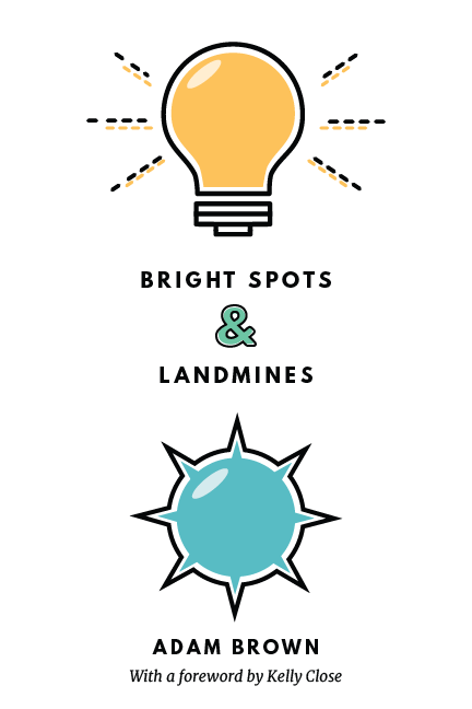
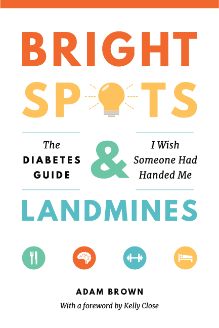
A few of the initial cover concepts with the final concept (pictured right). Adding more color helped to create a bolder, more interesting cover.
Making it internet official
|
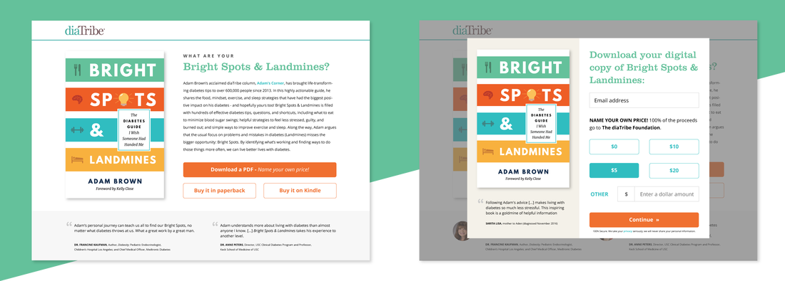
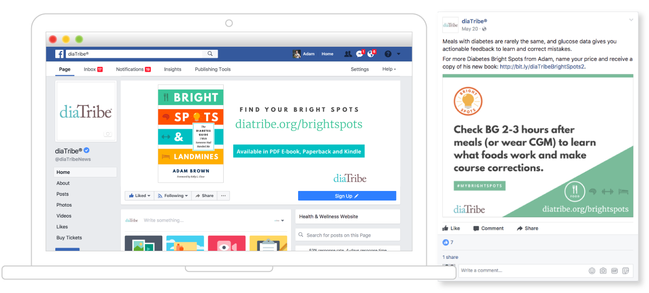
When layout was completed (!!!), I applied the same visual language to digital marketing channels. The most important component was the microsite and the ability to name your own price for the eBook. The site was also a place to learn about the project and read excerpts and testimonials. I also created social media graphics that were used to tease the launch and continue to drive social engagement and traffic. These graphics focused on one tip at a time and could be easily shared.
|
Launch day!
|
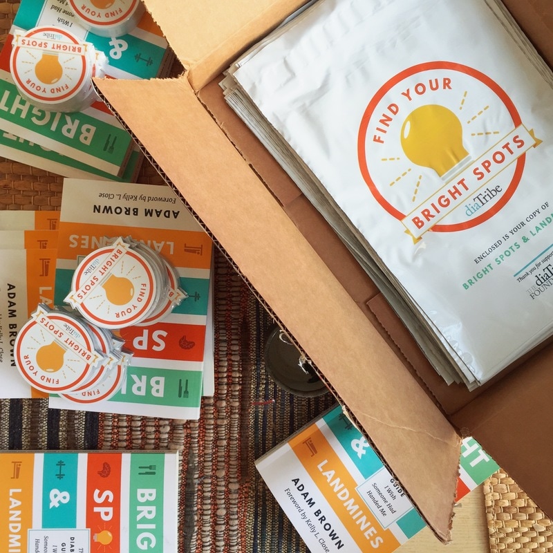
On May 9, 2017, Bright Spots & Landmines was released as a name-your-own-price eBook or paperback/Kindle purchase on Amazon. The marketing effort consisted of an early launch team, dozens of advanced copies mailed to health care professionals and advocates, social media marketing, and more. On its launch day, the book reached #210 out of over 8 million print books on Amazon and 225,000 copies have been distributed to this day. The book has been featured on diabetes podcasts (Diabetes Connections, Juicebox Podcast) and coverage/notable mentions have spanned industry publications (Diabetes Forecast, Diabetes Daily, A Sweet Life) to mainstream media (Huffington Post, U.S. News & World Report).
|


