
AMI:
|
|
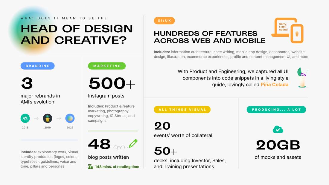
From 2017-2022, I was the Head of Design & Creative at AMI (formerly Maven Technologies), which is, I’ll admit, a pretty open-ended job title.
But, it truly captured all of the things I wanted to work on without limits. In my time at AMI, I can say without fail that I touched every creative aspect of the company and not only provided direction but also Did. The. Work. Here’s a quick rundown: |
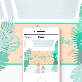
The evolution of the AMI brandAs with any small startup, the Maven/AMI brand evolved quickly as we “grew up”—refining our products, solidifying our audiences, and tightening our focus along the way. This meant that the brand went through just as much change in both visual identity and voice and tone.
Branding is one of my favorite responsibilities as a designer because it involves seeking out others and asking a lot of questions before you can even begin; it’s not something that a creative person just “comes up with” on the spot without collaboration, exploration, and understanding. When I arrived on my first day at AMI, we were a small team of 5 people, hoping to market a mobile sales tool to direct sellers, many of whom were just making the switch from analog paper processes to digital methods. At the end of the AMI journey, we were partnering with household-name retailers and creating portals for brands to run every aspect of an influencer marketing program. As a result, our brand went through some big Glow Ups, but at the core, we still remained true to ourselves, never forgetting our humble beginnings. |
|
|
|
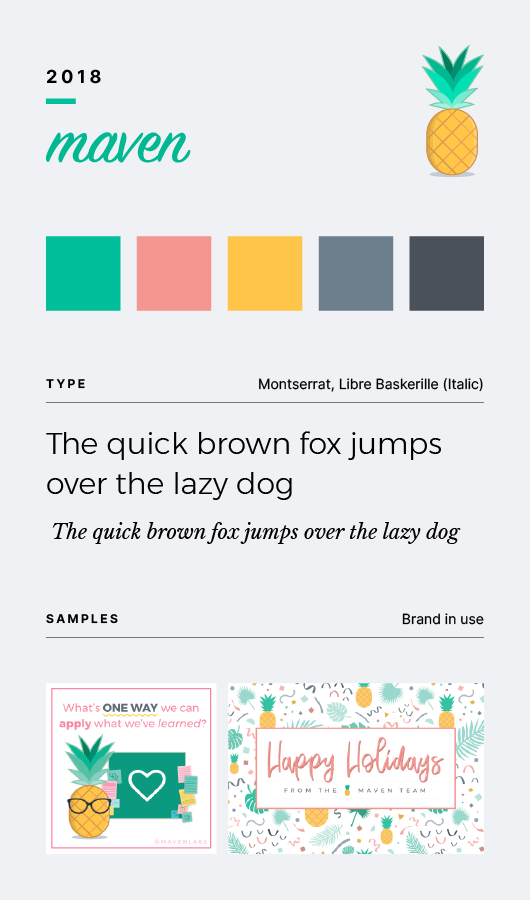
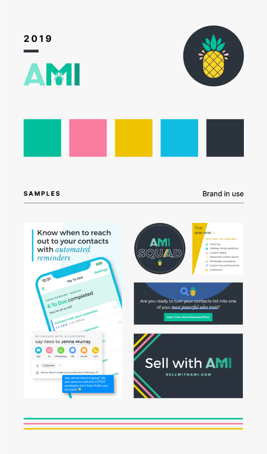
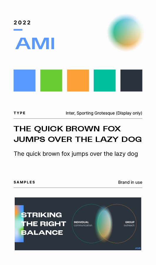
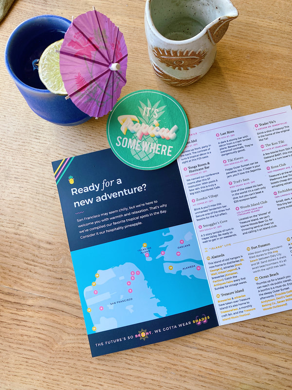
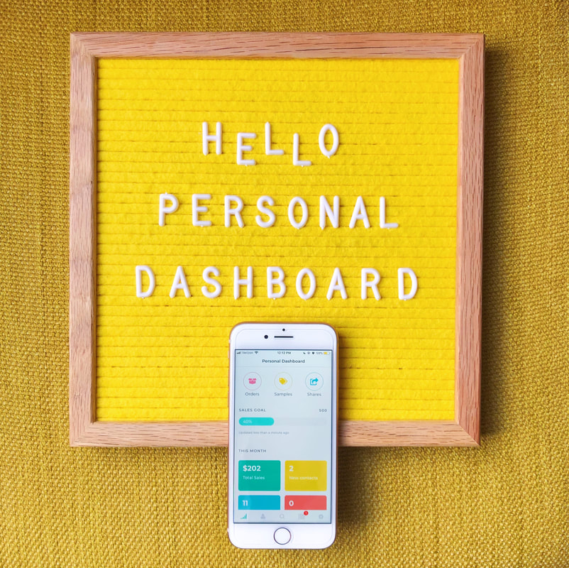
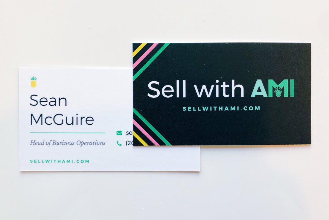
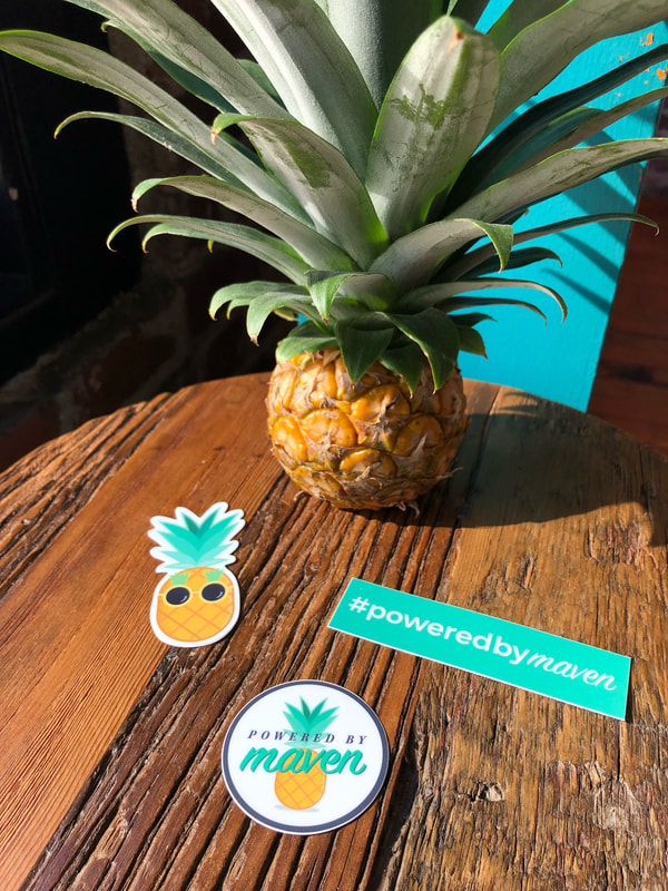
Snippets of the AMI branding evolution over time
|
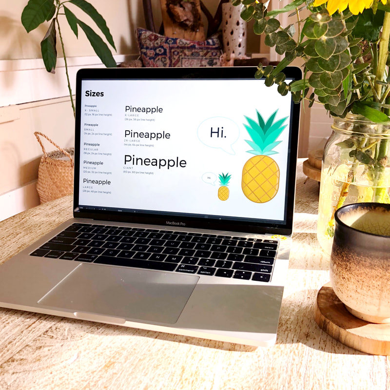
In its first few iterations, the (then) Maven branding featured a colorful palette with a soft saturation and a reliance on a fun, hand-illustrated feel to bridge the gap for our users who were just starting to use mobile tools for their businesses. As we grew our audience and released a “self-serve” version of our app, we wanted our brand to become more professional and universal, ultimately moving away from illustration while keeping our classic pineapple at the front and center. We had our typography and color steal more of the show.
In its final iteration in 2021-2022, the AMI brand moved toward a more modern approach when we released our brand portal for influencer marketing, using color, contrast, and type to grow into a trustworthy platform for enterprise. We blended our warm and cool colors into gradients to convey our holistic approach where a brand could control more aspects of its influencer marketing programs with AMI. |
Both sides of the coin: Crafting experiences for individual sellers and their brandsOne of the most interesting areas of exploration for me was the mixing of old-school and new-school retail and brand marketing. Our bread and butter for many years was creating digital sales tools for direct sellers (think: Tupperware parties). I think many would believe that this style of sales may be the opposite of our current highly scalable, wide-reaching ecommerce world, but all of the knowledge we gained working on problems for peer-to-peer sellers directly informed our approach to new-wave retail via social media influencers and affiliates.
Some feature highlights include:
|
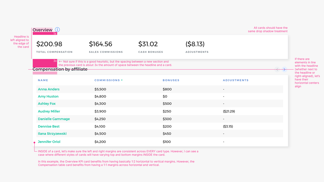
The perfect blend of Brand and UI:
|
|
|
The less visible sides of a brandLogos, colors, and fonts aren’t the only pieces of the branding puzzle. Voice and tone (expressed visually, in writing, or even just in conveyed feeling) can seem like an afterthought in branding, but it’s just as important.
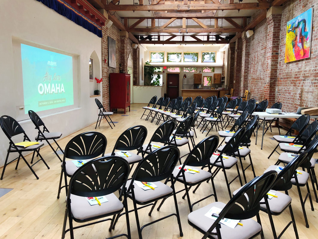
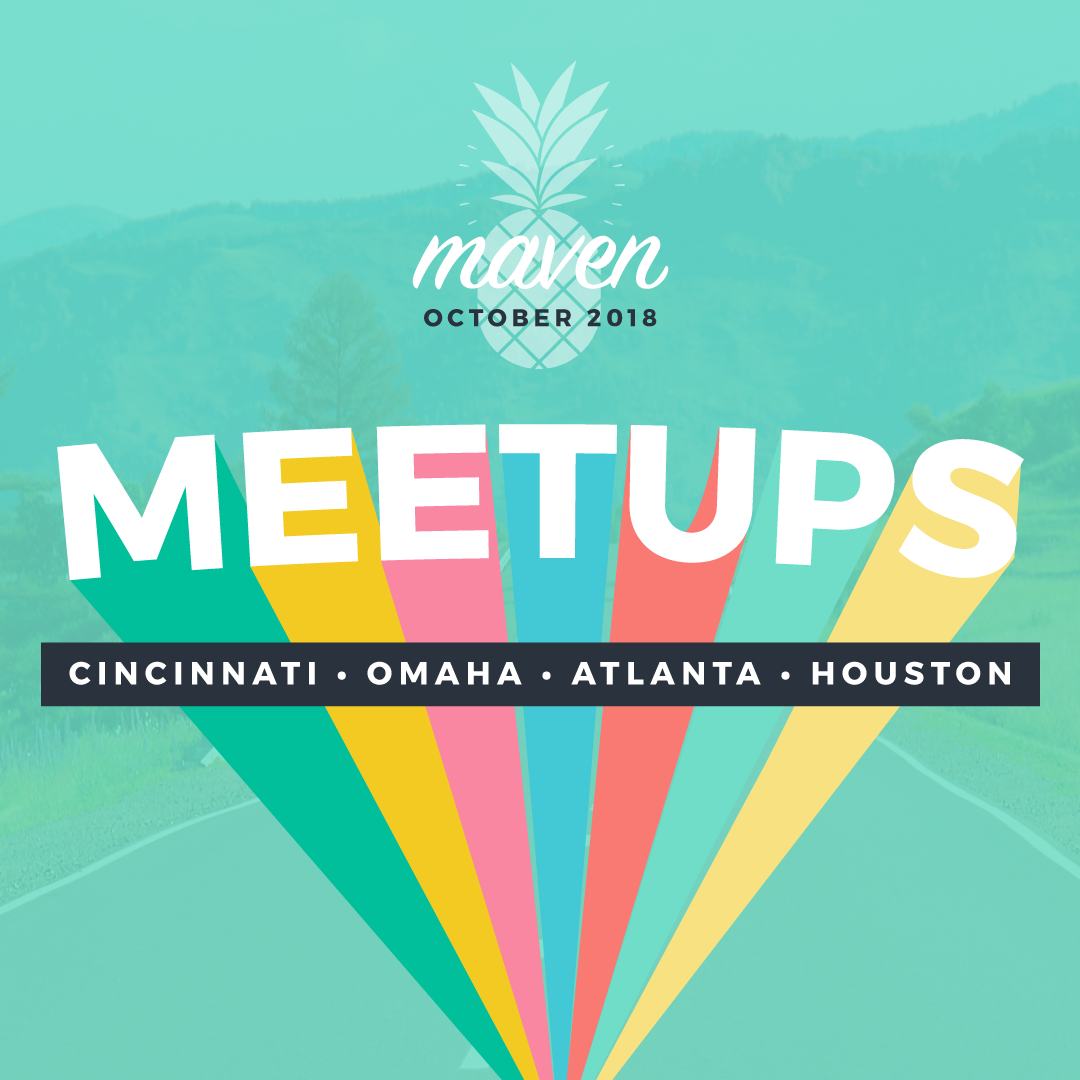
In the beginning, AMI focused a lot of time and attention on 1:1 relationships with our users—the same driving principle of our mobile app. In all of our communications, training, and community-building, we put ourselves in our users’ shoes and even met many of them where they were at, literally, by hosting meetups in small cities across the country. I had the chance to write and edit most of AMI’s digital communications via our company blog, social media, and LinkedIn. I synthesized user interviews, put human language to highly technical feature updates, and wrote tips and training advice with compassion. You can find the writing samples on AMI’s social media and Medium blog. Later, when our communications were more geared toward enterprise sales and marketing teams, I worked with marketing superstar Mei Loo to edit content for our company’s LinkedIn page. |
☁️
|

|
|
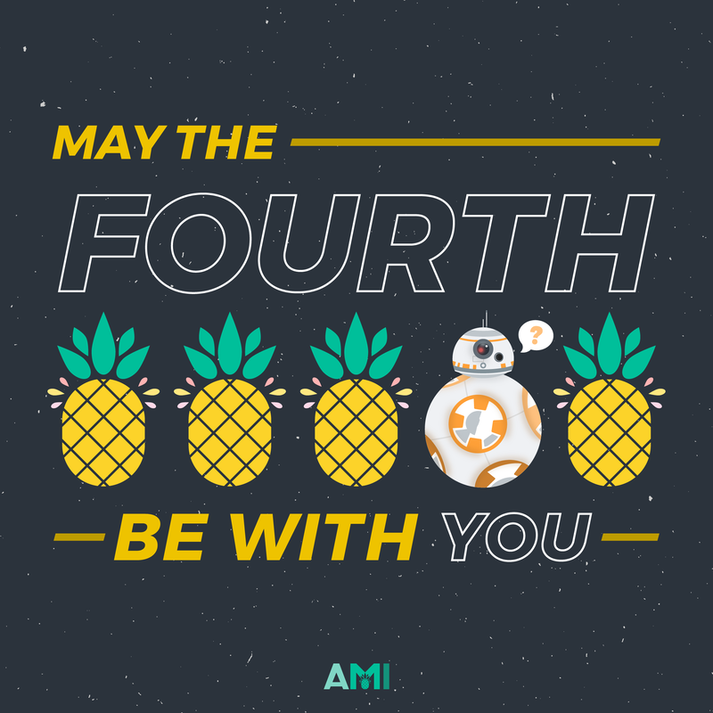
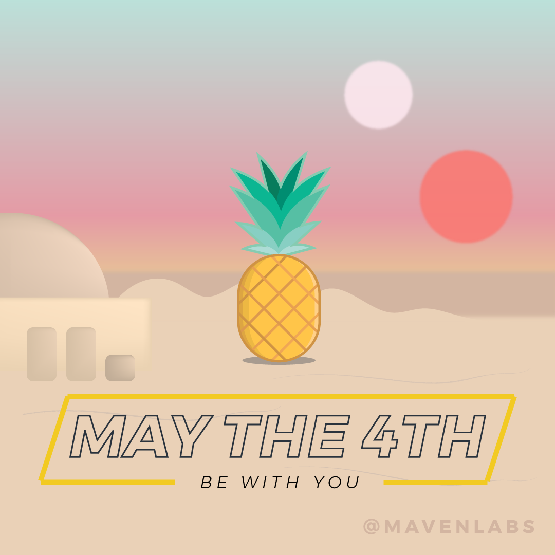
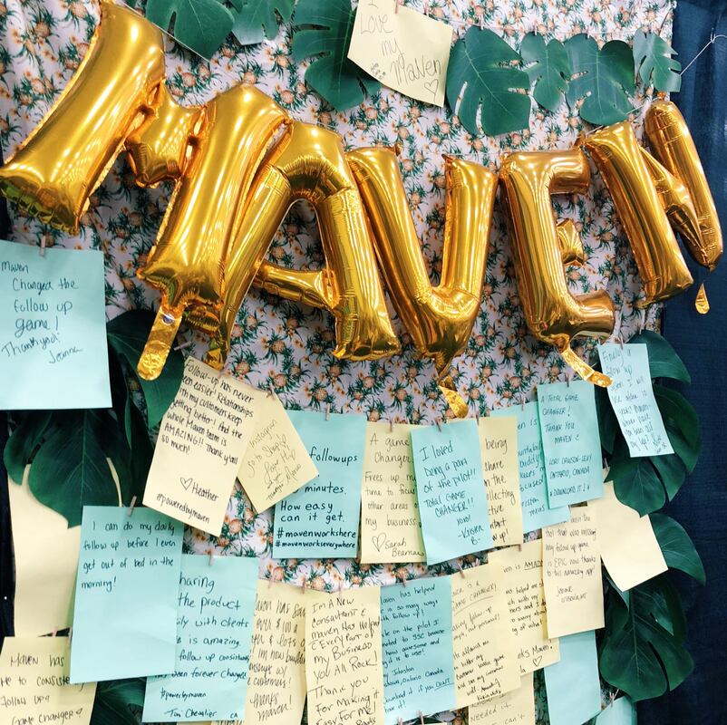

💛🍍In late summer 2022, AMI closed its doors in the face of the tech recession after 6.5 years of operation. Even though many people opt not to take on the “risk” of joining a startup, I’ve always loved working on a small team where my work truly matters. This portfolio entry is only a taste of the depth and breadth of work I got to do in my time here. I’ll really miss this small but mighty team.
|